Tivoli Trading
Brand identity and website, 2025

Overview
Tivoli Trading is an institutional-grade crypto trading platform, built by crypto-natives for execution and access across CEXs and DeFi. I shaped its brand identity, built around a clean lowercase logotype, and designed the website that puts it to work.
Identity
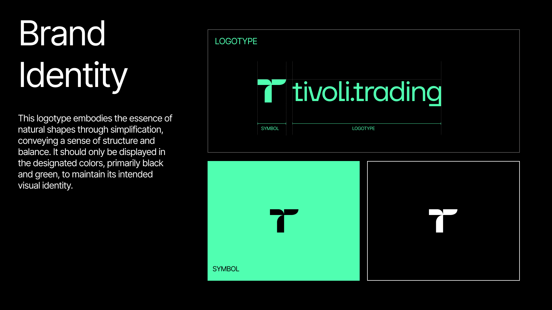
The logotype simplifies natural shapes into something structured and balanced. A compact T symbol pairs with the tivoli.trading wordmark, all held to a tight palette of black and green so the mark always reads as itself.
Type
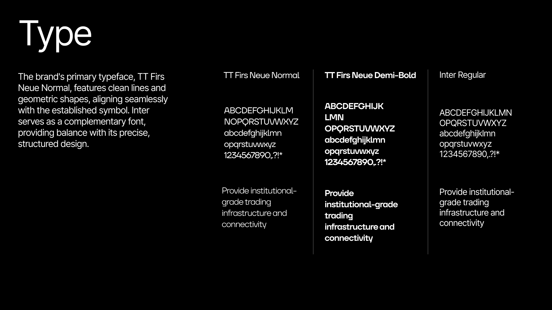
TT Firs Neue carries the brand, its clean, geometric lines echoing the symbol across Normal and Demi-Bold. Inter is the complementary face for interface and long-form text: precise and structured.
Website
The site is dark and confident, its green accents and flowing wave motif carrying the brand from the first scroll. It leads with the promise, institutional-grade execution and access to CEXs, and keeps the path to a demo short.