Tivoli Trading
Brand identity and website, 2025

Overview
Tivoli Trading is a crypto trading platform focused on institutional execution and access across centralized exchanges and decentralized finance.
I developed the visual identity and designed the website around a simple objective: make a technically sophisticated trading business feel credible, focused and established without relying on the visual conventions of retail crypto.
Identity
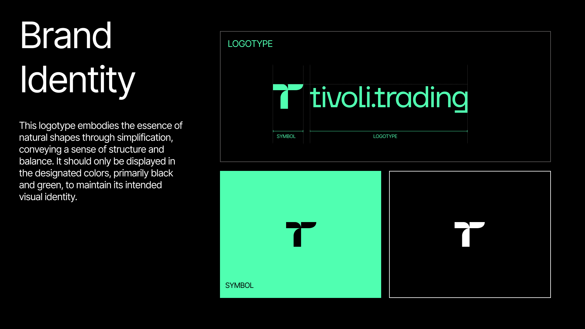
The identity is built around a compact lowercase wordmark and a reduced T symbol. The forms are simple and controlled, paired with a narrow palette of black and green. The system was designed to remain recognizable across both expressive brand moments and smaller functional applications.
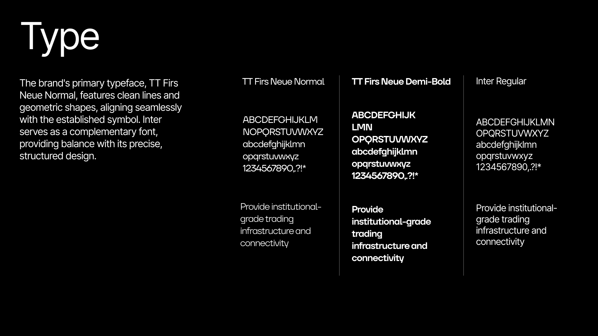
TT Firs Neue carries the main brand voice, with Inter supporting interface and longer form content.
Website
The website puts the offer ahead of explanation. Institutional execution and access are established immediately, then the supporting product information gives prospective clients enough context to understand how Tivoli operates.
The visual language remains deliberately controlled. Motion and the green wave motif create distinction, while typography, layout and hierarchy keep the product credible for a professional audience. The path from understanding the offer to requesting a demo stays short throughout.

See it at tivoli.trading.