Axion
Website and identity, 2025
Overview
Axion supplies and services advanced CNC machinery for manufacturers across Slovenia, Croatia, Serbia, and Bosnia and Herzegovina, representing makers like YCM, IBARMIA, and TAKISAWA. I designed their website and the identity behind it.
The buyers here are technical and exacting, choosing machines they’ll run for years and stake their own production on. So the work had one job above all: to feel as precise and dependable as the equipment itself, and to make Axion read as the serious, long-term partner behind it.
Identity
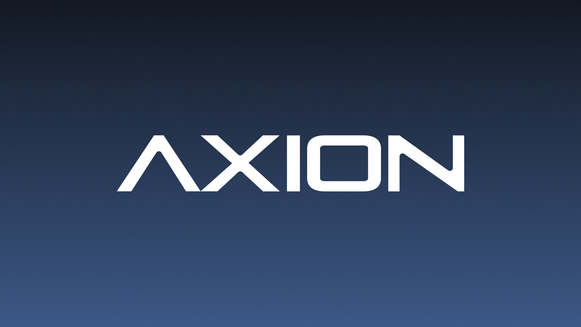
The wordmark is engineered and precise, its cut, angular letterforms echoing precision machining without shouting about it. The symbol reduces the A to a single sharp peak: a compact mark that holds up small, on a machine, a badge, or a favicon. The palette stays deliberately spare, so nothing competes with the products themselves.

Website
The site carries the same restraint. It leads with the machines and the makers Axion represents, and organises a broad, technical catalogue so a manufacturer can find the right machine and its specifications without wading through noise.
Servicing and support get equal weight, because for this audience the after-sale matters as much as the sale, and the path to a real conversation is always short. See it live at axion.si.