Axion
Website and identity, 2025
Overview
Axion supplies and services advanced CNC machinery for manufacturers across Slovenia, Croatia, Serbia and Bosnia and Herzegovina. I designed its identity and website.
The audience is technical and the buying decision is substantial. These are machines manufacturers depend on for years, so the company needed to communicate precision, reliability and long term support rather than simply present a catalogue.
Identity
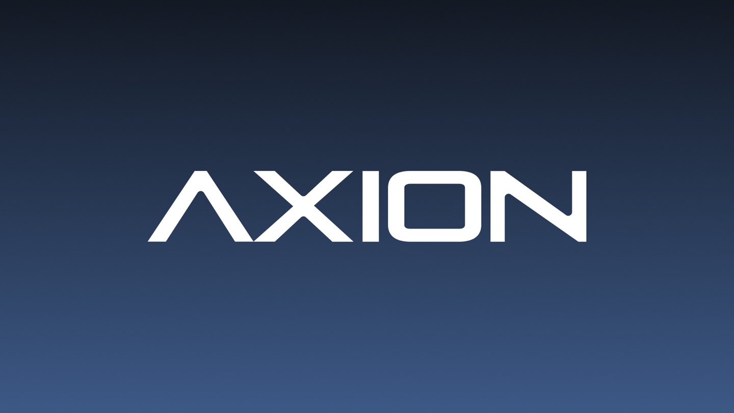
The identity takes its cues from the machines Axion represents without trying to imitate industrial aesthetics literally. The wordmark uses precise, angular forms, while the symbol reduces the letter A to a compact geometric mark that can work across the website, equipment, documents and smaller applications.
The palette stays deliberately restrained so the machinery remains the visual focus.

Website
The website organizes a broad technical catalogue around the way manufacturers actually evaluate equipment. Machines and manufacturers are easy to browse, specifications remain close to the product, and service receives the same prominence as sales.
That distinction mattered. For this audience, choosing the machine is only one part of the decision. Maintenance, expertise and long term support are part of the product they are buying.
The result is a site that feels closer to the equipment itself: precise, functional and built to last.
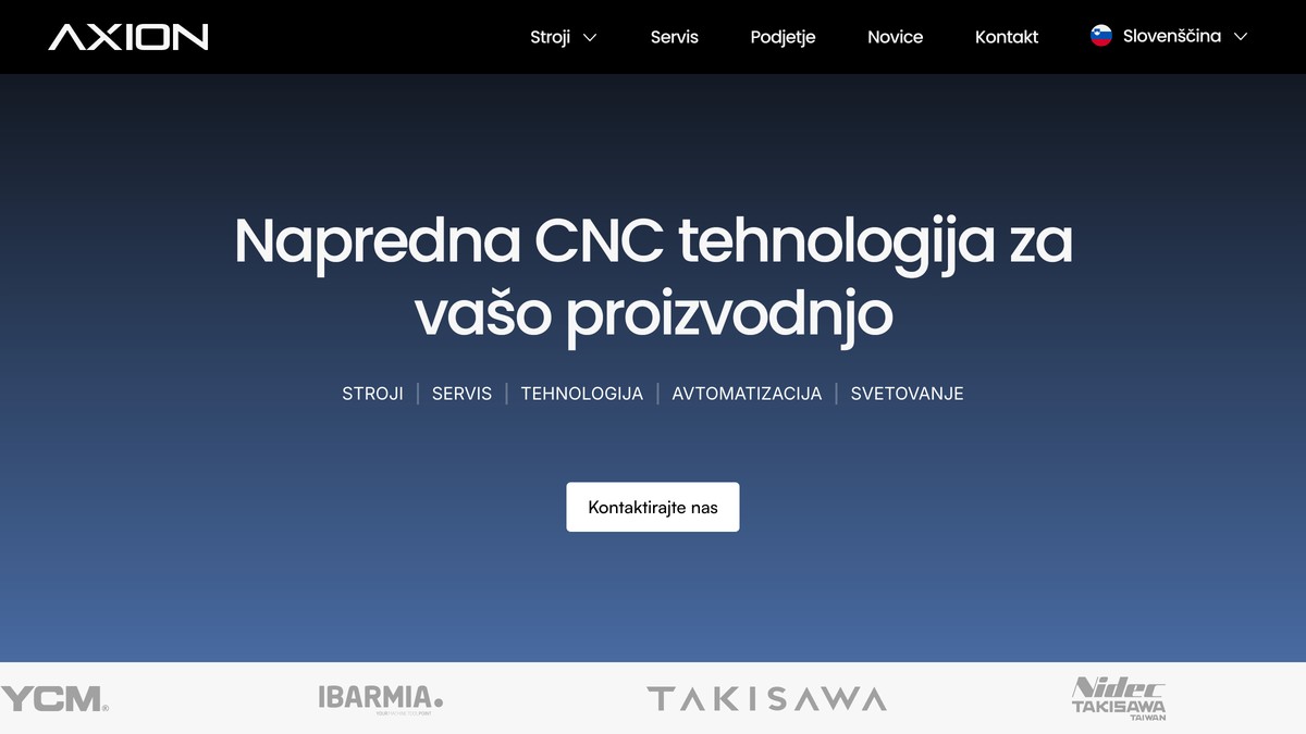
The site is built in Framer. See it at axion.si.